Reviving the Narrative: Audit & Refresh of a Healthcare Content Hub
North Carolina Healthcare Association
The North Carolina Healthcare Association (NCHA) has undertaken a multi-year effort to ‘Claim the Narrative’ around healthcare in North Carolina. This effort, in part, involves original content creation highlighting the human aspect of healthcare.
Revive launched the It Takes a Hospital campaign and supporting content hub in September 2020. Nearly a year later, we performed an audit of the website to make sure we were aligned on the goals and objectives, and identify areas that could be improved for the user.
Problem
When the content hub was first launched, the goal was to use powerful storytelling to engage users and help them understand what was going on in healthcare around their state, and then provide them with advocacy opportunities that could help change things. But after several months of focusing on one-off client asks, we were finding that advocacy had fallen by the wayside and we weren’t providing users with enough clear actions they could take.
Problem statement: How might we make improvements to allow NC residents to take action and get involved in their community?
We want users to…
- Engage with storytelling content
- Engage with advocacy opportunities
- Subscribe to the newsletter
- Share storytelling content on social
- Register for events
- Follow on social channels
Discovery
Audit
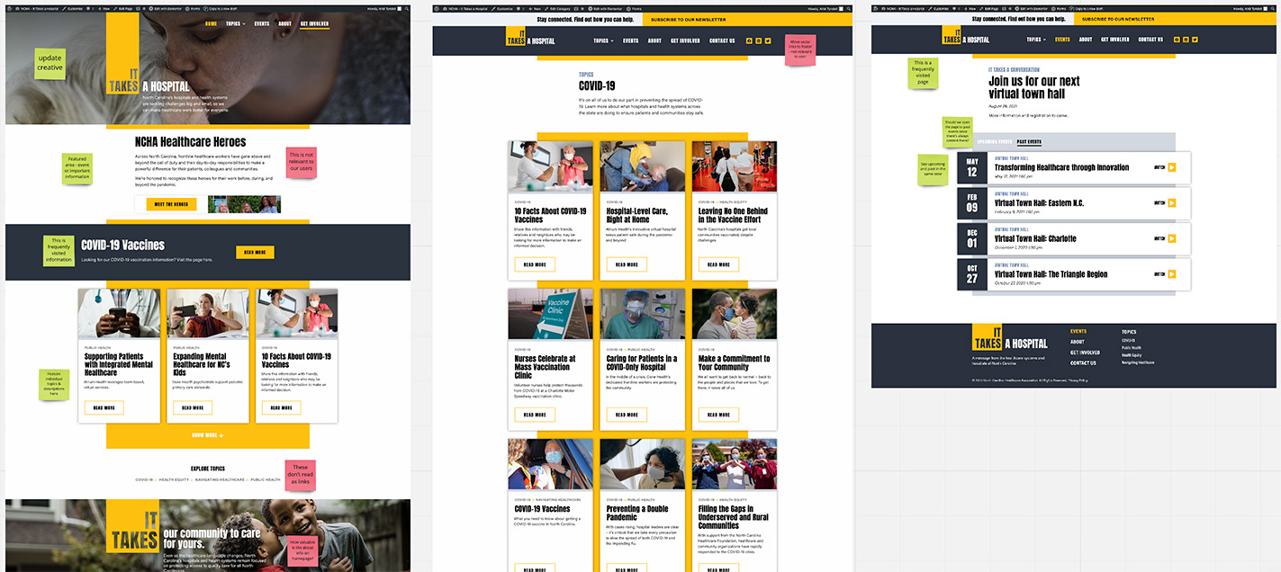
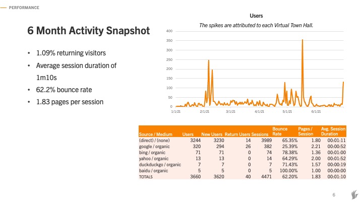
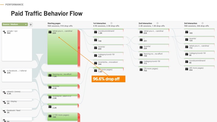
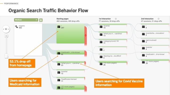
I began the website audit by pulling screenshots into a Miro board and adding sticky notes to get my initial thoughts and assumptions down. I then began reviewing heatmaps and analytics. Overall, we found that returning visitors was very low at 1.09%, and session duration was only a little over 1 minute, which was concerning to us given that we want users to interact with our longer-form content.
Findings
What’s working well:
- Users are engaging with featured content immediately below the hero area.
- Information about COVID vaccines has the highest engagement, and we’ve seen this user interest in our paid media buys, like paid search, as well.
- Newsletter banner and bottom of page forms are getting clicks.
Areas for improvement:
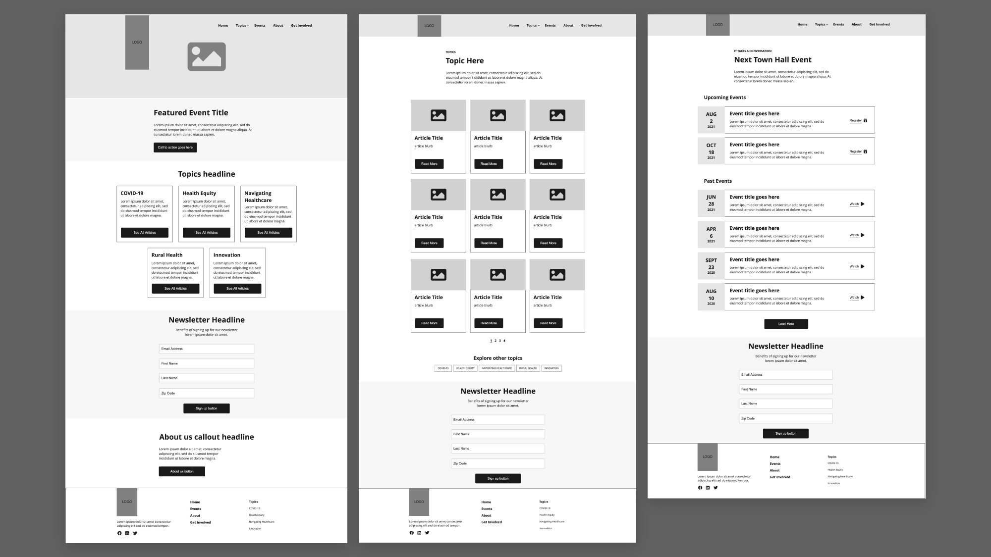
- Homepage articles are not getting many clicks – defining the topics and their contents on the homepage may help with confusion.
- Events page gets a lot of visitors but lands on upcoming events tab, which is usually empty.
- High drop off rate from Get Involved page – we need to provide clear and easy actions for the user to take.
- High drop off rate from About page – we’re not giving the user much to do here.
Wireframes
Visual Design
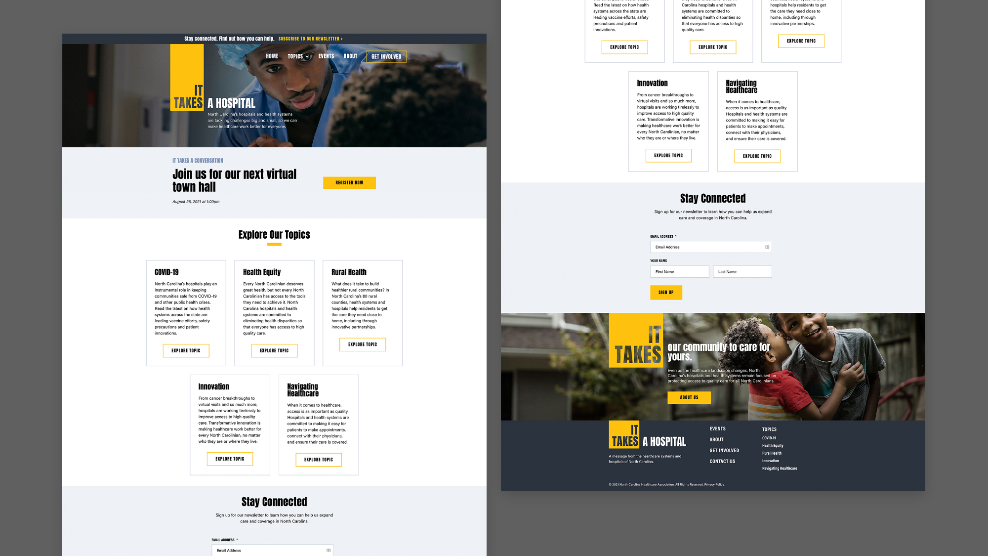
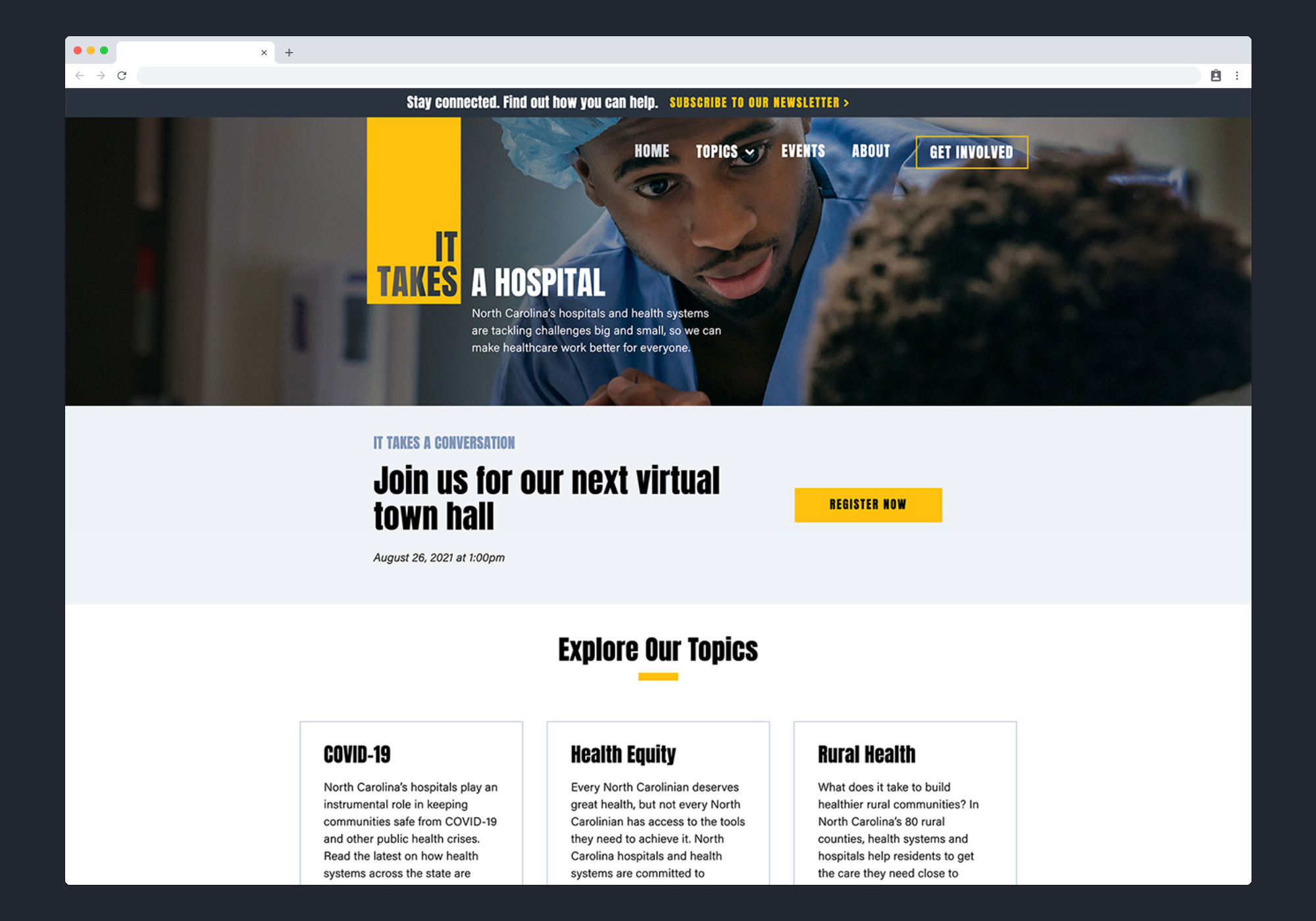
There weren’t necessarily changes needed to the visual design of the site, but the original design felt very heavy with the chunky condensed fonts and dark drop shadows. It also had an overuse of the gold color which made it difficult for the user to tell what was an important CTA or just decoration.
I removed all of the drop shadows and reduced the use of gold, bringing in more white space to allow the users eye to rest.
